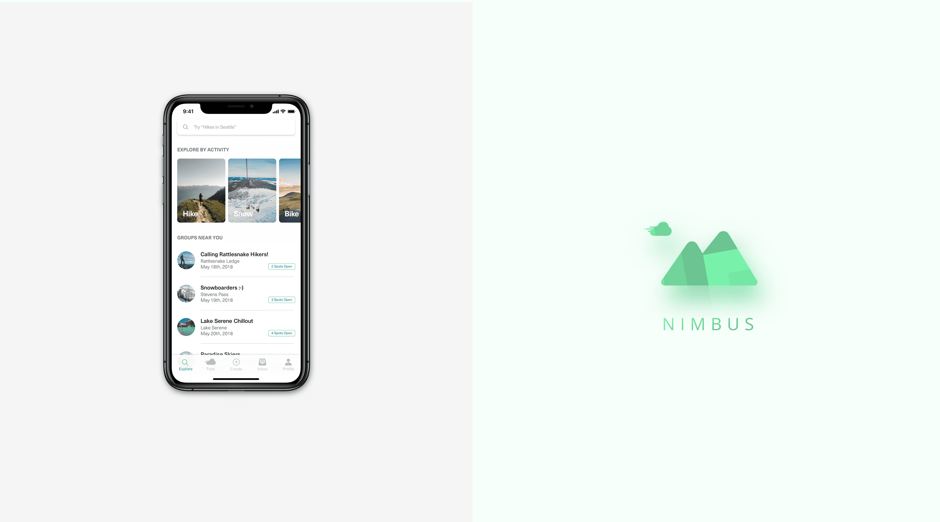
Nimbus is a mobile experience that aims to solve the transport challenges of remote outdoor exploration by connecting adventurers with one another and having them share transport to outdoor recreation areas.
Why are we doing this?
I love being in the outdoors. It matters not if I’m on the beach, the mountains or the rainforest – there’s something about getting lost in nature that reinvigorates the soul. And I’m not alone in feeling this way; With over 300 million National Park visits in 2019 alone, the outdoors is absolutely exploding in popularity. Getting there however, is often the biggest obstacle in itself. With a majority of outdoor destinations in remote locales, access to a personal vehicle is almost all but necessary.
This seemingly innocuous obstacle also brings about the specter of socioeconomic inequity; By basing access to a vehicle as a precondition, it's almost as if the outdoors has become a playground that's exclusive to the well-off. Nimbus is our take on solving this problem. By connecting outdoor enthusiasts with like-minded peers and have them carpool to outdoor destinations, our hope was to bridge the transportation barrier and enable access to the outdoors to all.
“Thousands of tired, nerve-shaken, over-civilized people are beginning to find out that going to the mountains is going home; that wildness is a necessity.”
– John Muir, Our National Parks
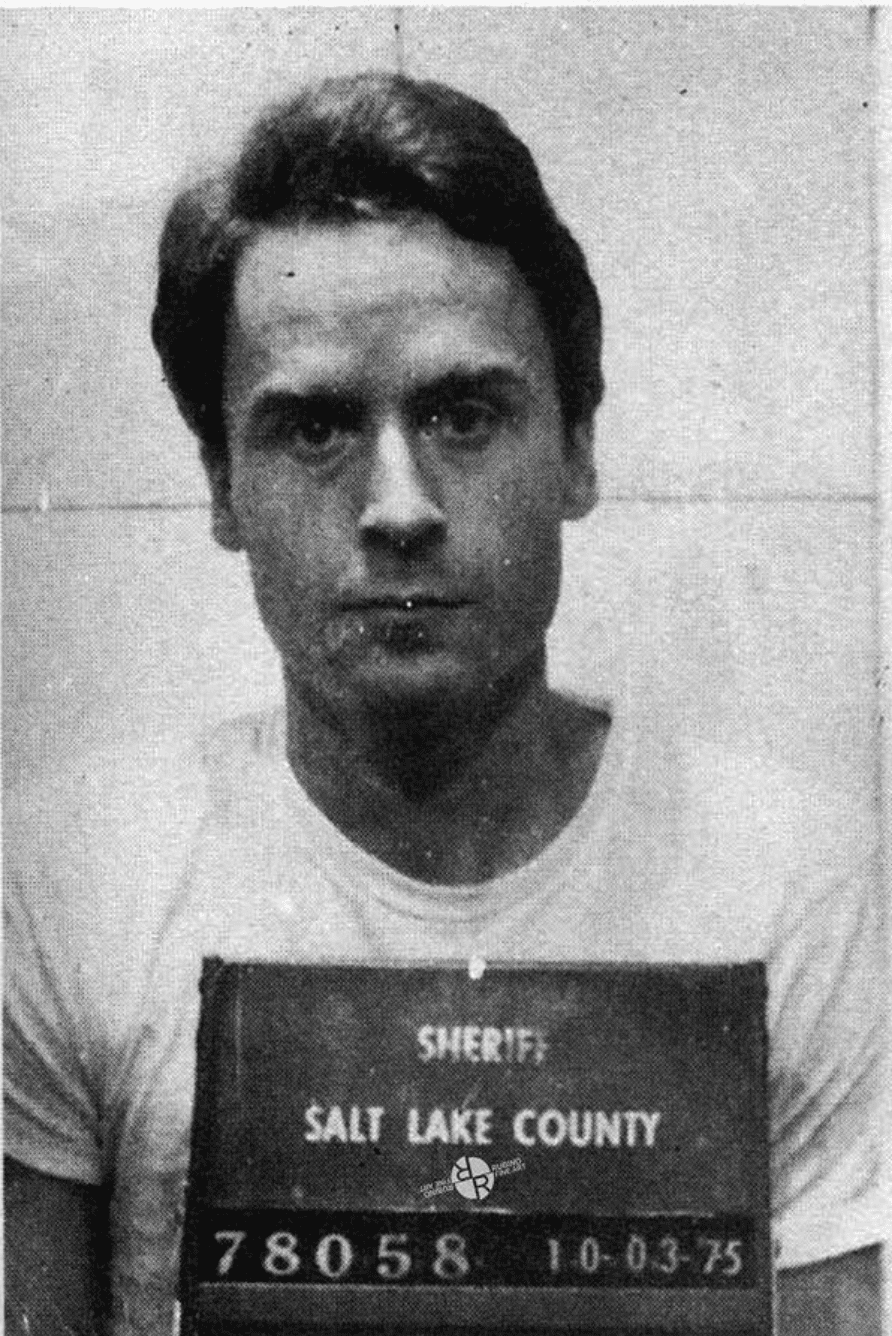
"What if I end up with a serial killer?" was the soundbite that stood out during our surveys. The specter of Ted Bundy, one of America's most notorious serial killers, loomed large.
Getting into cars with strangers. (Or not)
User safety was the primary concern expressed by our professor and mentor, Brian Fling. The initial plan was to have users ride-share to outdoor destinations – sort of like Uber for the outdoors. However, the idea of having users travel with strangers to remote locales left a fair degree of apprehension. Our surveys indicated a similar sentiment amongst our users as well.
The immediate priority in our following sprint was therefore to alleviate potential safety issues. One of our key mitigative measures was the introduction of user profiles.
Designing for Trust and Community.
We hypothesized that user profiles would help build trust & social proof; by encouraging users to share a little piece of themselves, it opens up a small window of mutual vulnerability that we hoped would dispel fear or uncertainty with using the platform. It also offers users a perception of control by allowing them to research their counterparts rather than stepping off blind into the unknown.
As we tested our user profiles further, we discovered that many of our users were in fact expressing more concern over chemistry & compatibility with potential travel companions than with their own personal safety. It was almost as if the safety concerns went out the window when our users got to see a user profile for themselves
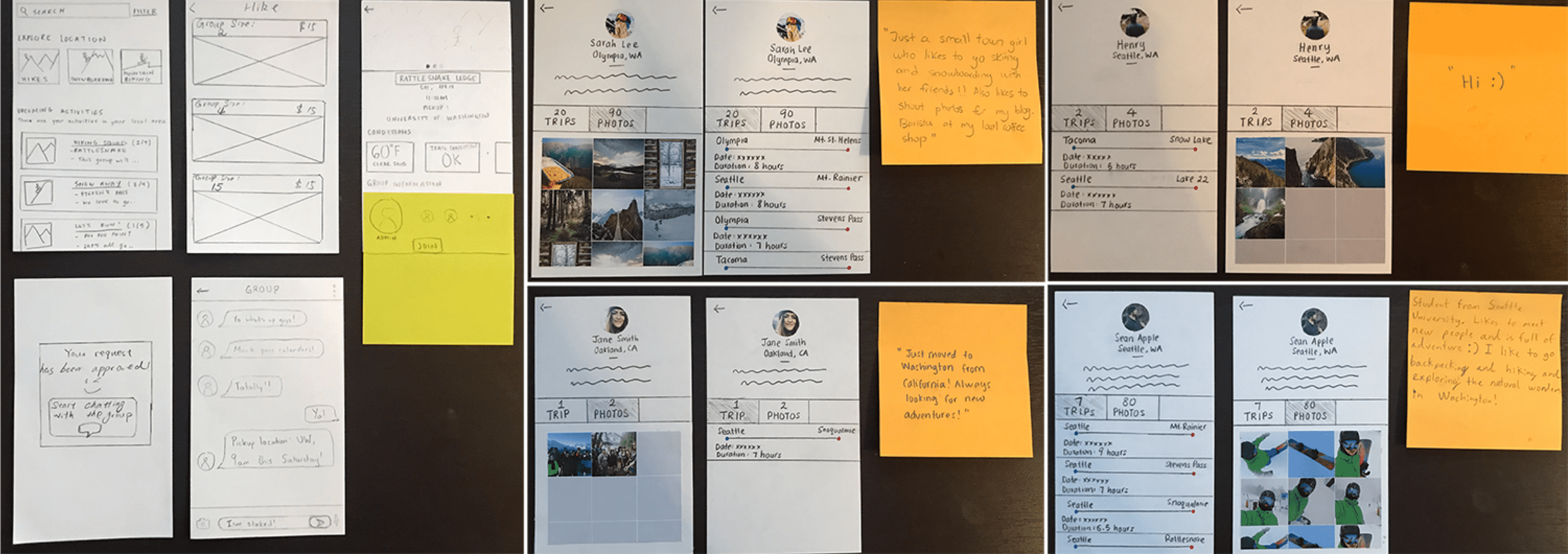
First impressions matter. While we believed that full profiles go a long way towards building trust, we wanted to test that hypothesis nonetheless. We designed user profiles with varying degrees of sketchy personas and had testers rate their comfort levels with each profile.
In addition, we realized that the sheer remoteness means that there is safety in numbers. For example, if you were backcountry skiing and somehow got caught in an avalanche, having a partner on hand to call rescue or dig you out could mean the difference between life or death.
With the introduction of profiles and emphasis on safety in numbers, Nimbus evolved from "National Park Uber" to something more akin to a hybrid of AirBnb and a local outdoor Facebook community. Our concept was now premised on having users group up and adventure outdoors together.
Test. Iterate. Then test it again.
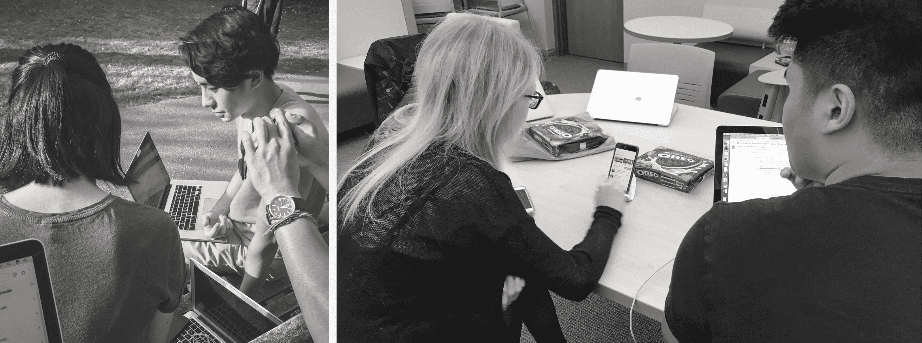
If that sounds like Groundhog Day to you, you’re probably not wrong. We adopted a rapid prototyping based approach and let our users steer where we went with our designs through frequent iteration and testing. You’ve already seen the paper prototypes up top. I've also interspesed the rest of this case study with various screens and prototypes of differing fidelities.
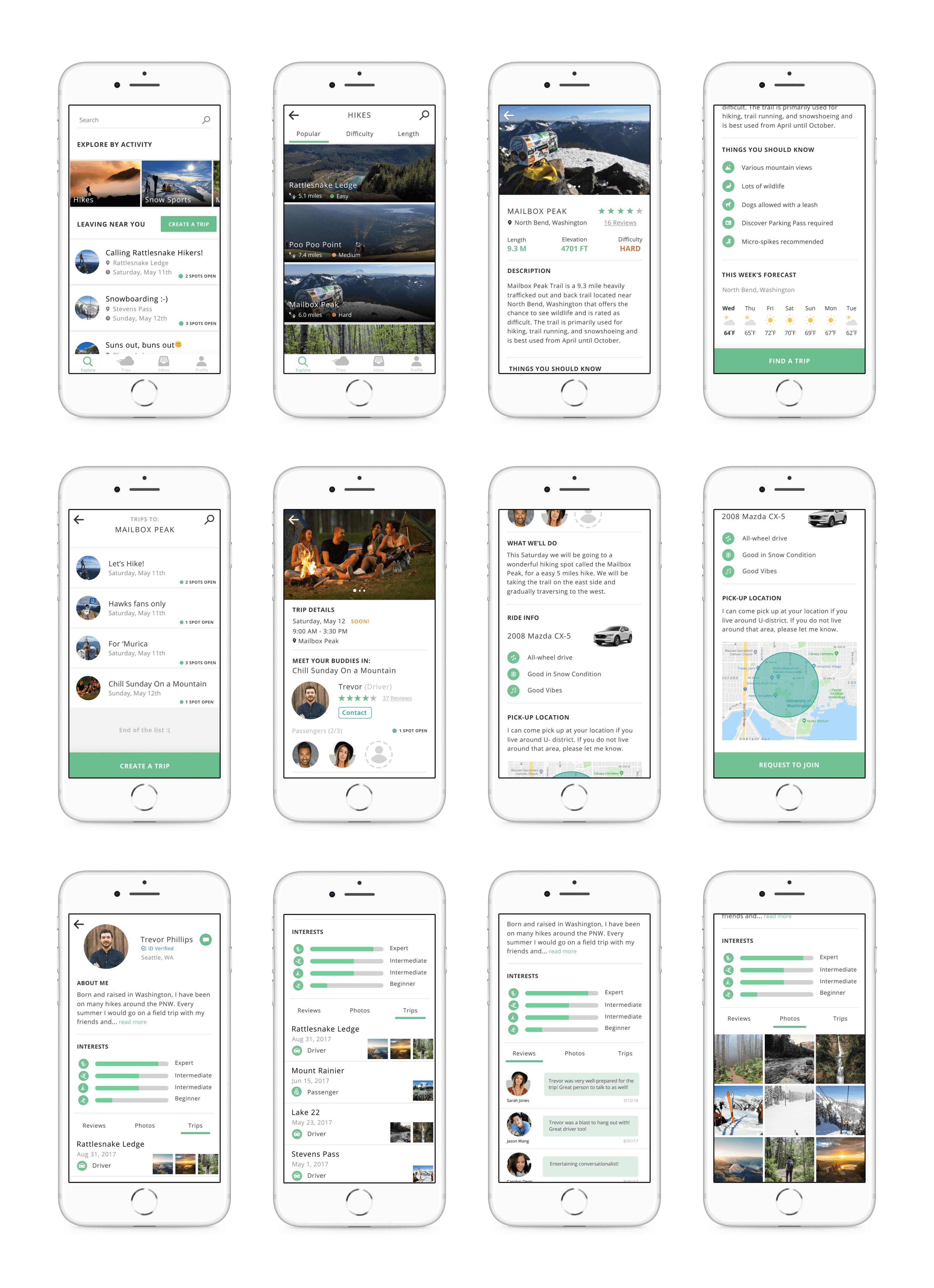
We attempted to take advantage of existing conceptual models whenever possible. The idea was to maximize intuitiveness by leveraging a user’s familiarity with existing processes. The above diagram depicts a rough flow of our “join a group” process here which was really modelled after AirBnb’s flow for making a reservation with a host
We talked to people but more importantly, we listened.
We prized user feedback above all else. While we sought to test specific features and flows in our user tests, we also took the opportunity to conduct semi-structured interviews with our testers. As product designer, this was especially critical to me; Because as much as I thought I understood the problem space, I was not the user. Conversations with testers and potential users helped us check assumptions that we may have carried and also yielded insight that helped us evolve the product.
Our solution was fleshed out over a series of design sprints, where use cases as well as features were iterated and tested through rapid prototyping. Test, iterate and then test it again was the mantra we lived by.
User tests were conducted in both controlled settings and guerilla style where unwitting passer-bys were recruited to be impromptu testers. Conversations with testers were critical towards helping us expand our understand of the problem space and evolve our vision for the product.
We conducted most of our tests with low-fidelity wireframes. This allowed us a certain freedom to experiment and make changes because of the relatively low investment and effort put into the prototypes.
High-fidelity mockups were saved for last and only worked on after we validated our key flows and features with lower-fidelity prototypes. We were also constantly uncovering other pain points associated with outdoor travel during our testing process, and we sought to address some of them with our high-fi prototypes.
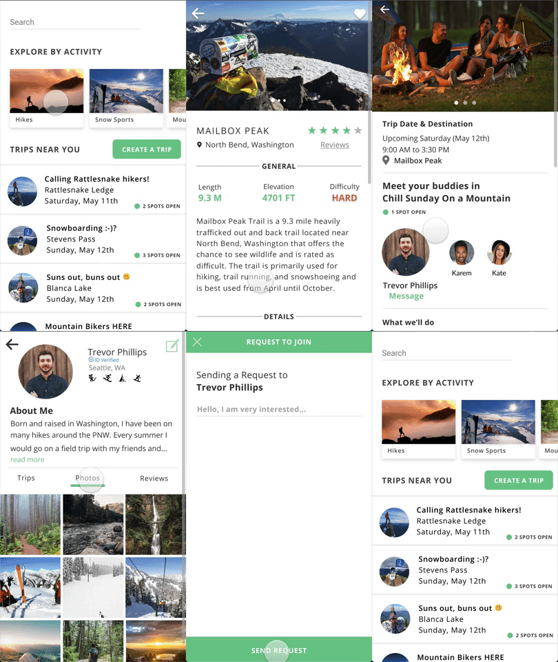
Users can search for and join groups based on location, difficulty, length, popularity etc.
Passing the vibe check.
Adventures in the outdoors are only as good as the company you’re with. With chemistry and compatibility cited as a major user concern, I wanted to let users be able to size each other up before committing to a group.
This was done through allowing users to search for groups through various criterias, encouraging users to talk to group hosts when requesting to join a group, having descriptive group listings and encouraging full profiles by all users.
Streamlining the preflight.
Difficulty in finding information relevant to the area of travel was one of our most cited pain points, with data either hard to find or out of date. I’ve personally been subject to this and have had close calls after being caught out by unexpected conditions or hazards in the outdoors.
I sought to address this by aggregating information relevant to the location such as conditions, terrain and hazards into a single page to help streamline the research and aid in user preparation.
An expression of vanity.
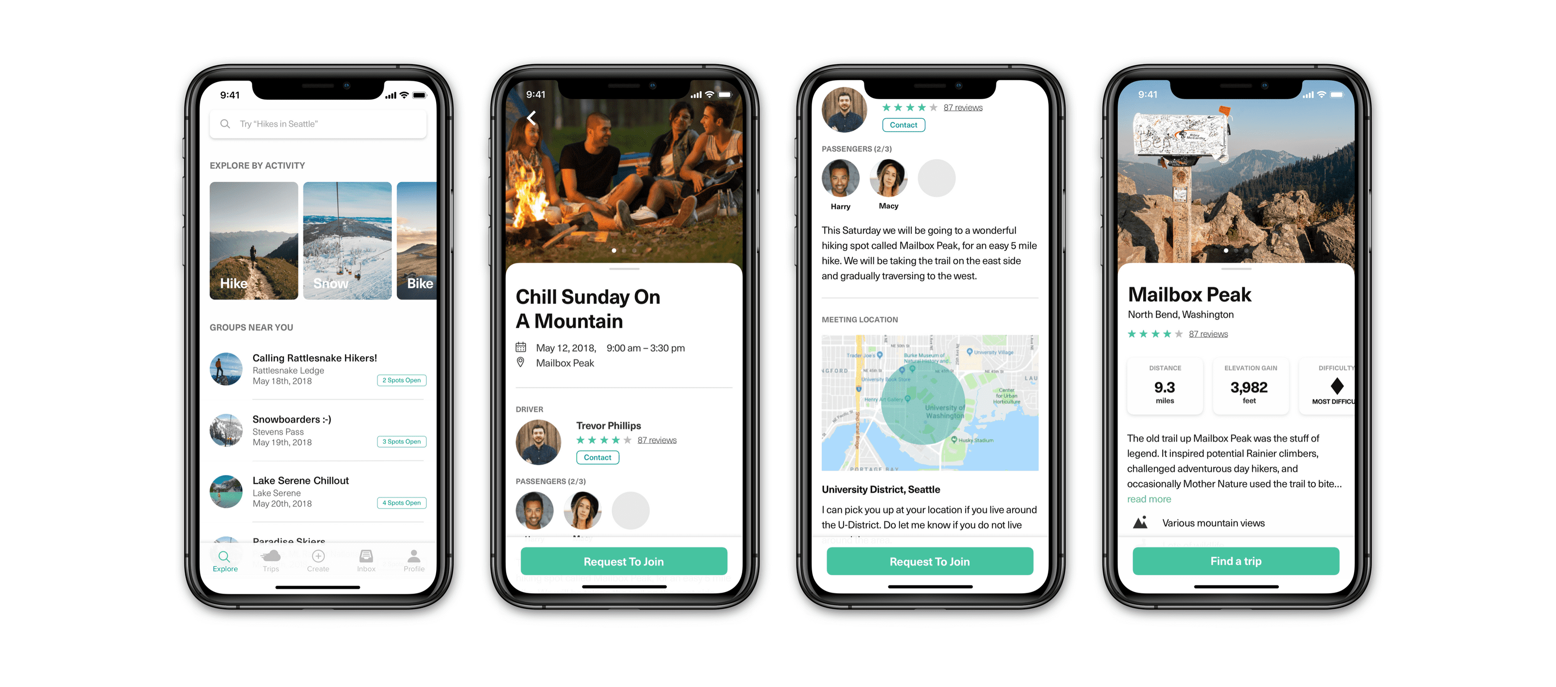
A couple of months after this project, the iPhone X became all the rage and designing for screens with a notch was to become flavor of the month/year. With the benefit of hindsight and fresh eyes, I set out on a little redesign exercise; mostly on the visual front with some work to clean up the alignment on a soft 8-point grid, strengthening the visual hierarchy etc.
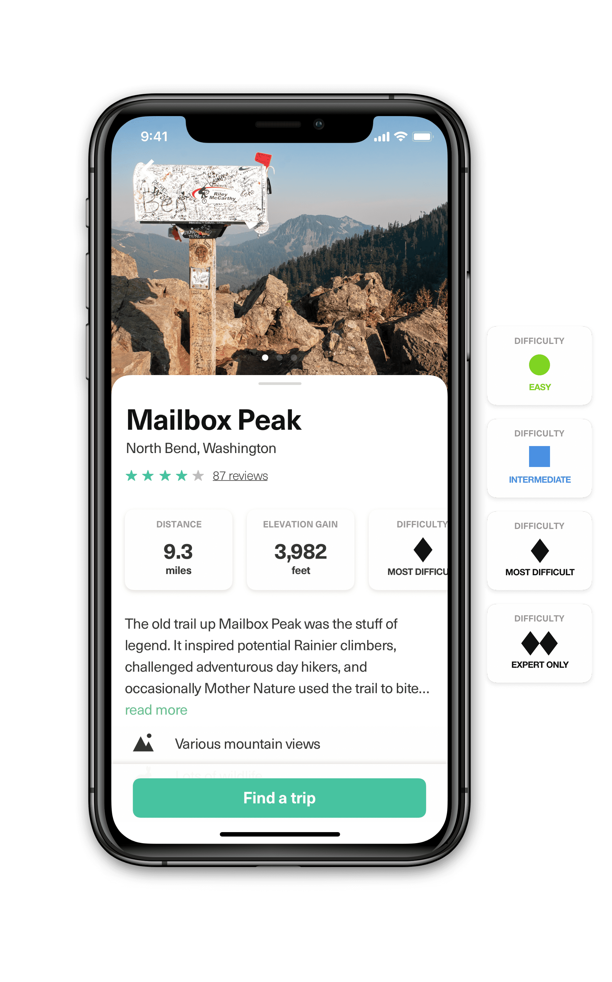
Brian (our prof) wasn’t too keen on us using traffic light color coding to denote difficulty in our original versions– and he’s got a point. Colors are loaded with meaning – for example: when we coded “hard” with the color red, the connotation is that there is danger to be expected. Yet that isn’t necessarily the case, because hard is just that – hard. There may be technical skillsets required but that doesn’t mean that something is or should be dangerous.
Difficult ≠ Dangerous. While Mailbox Peak here is known to be a thigh-burner of a hike, it is by no means dangerous with much of the trail being well marked and well maintained.
After some research, I decided to adopt the trail difficulty symbology system used by the National Ski Area's Association (NSAA).
The NSAA first adopted a system of signage in the winter of 1964-65. Before that, as if skiing on wooden boards with leather boots wasn’t hard enough, it was every man for himself. The colors they used were different than today and also conflicted with the colors used in Europe. American Resorts used yellow to designate intermediate trails and the French used red because, well who knows why—they’re French.
The anatomy of symbology.
The Walt Disney Company was looking into opening a ski resort in the 1960s. As part of that project, they did studies and tests on which colors worked best. They had even tested skier’s reactions to different geometric figures, concluding for example, that the symbol for easy terrain should be a circle, which was perceived as soft, and that the color of the circle should be green, which was perceived as mellow.
The Walt Disney system was adopted by the NSAA in 1968 and has served North American skiing well for over 50 years. As such, this is also the system I have chosen to adopt for this purpose today.
Next Steps.
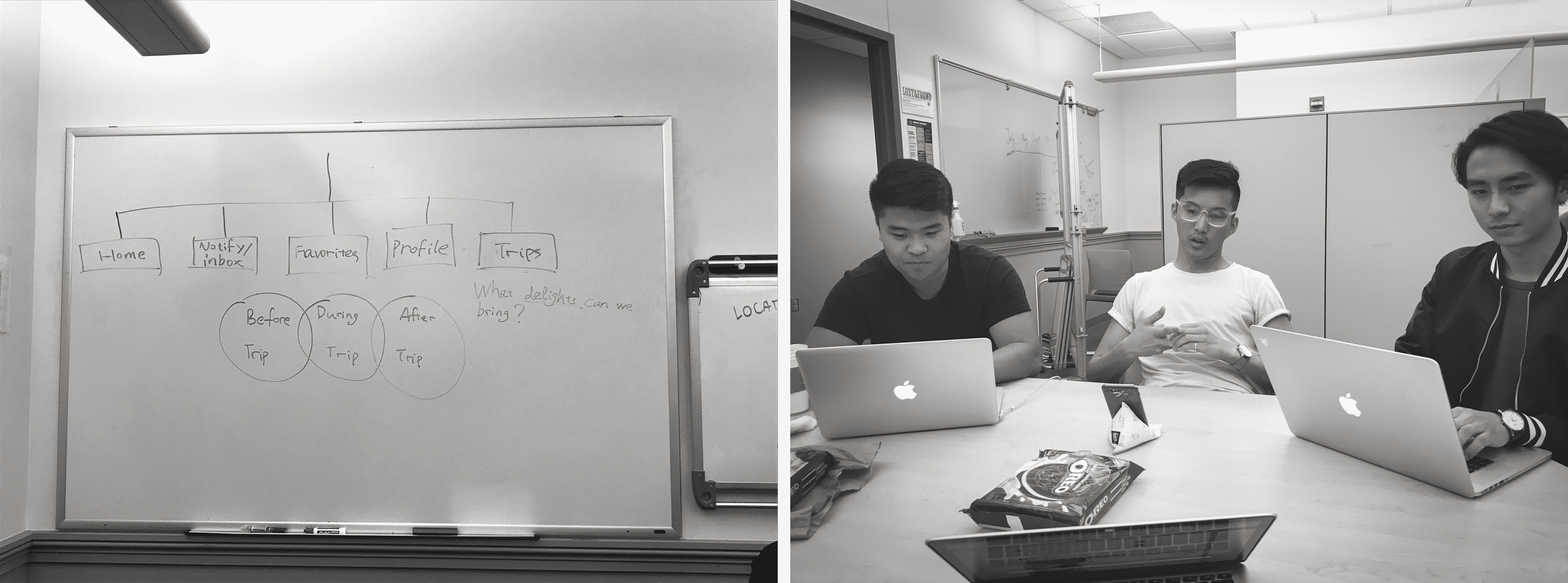
In terms of next steps, Nimbus has mostly covered the "before trip" aspect of outdoor travel, but there's also tremendous room to explore if we were thinking holistically about the outdoor experience. There are things we can implement “during the trip”, such as having trail maps, directories for nearest resources such as ranger stations, shelters and latrines, perhaps an ability to find out if there are other groups nearby (which dovetails into community).
The experience doesn’t end “after the trip” as well, ideally we would want users to continue engaging with one another, expand communities, plan new trips etc. There’s room to grow for Nimbus if given the time and opportunity to do so.
The Last Bit.
There were many lessons from this project. Many. I’ll roughly go through them in no particular order: User research is never one and done, keep ideas at its lowest fidelity, test and test some more, never assume anything – always acknowledge your assumptions and validate them, you are not the user, and the list goes on.
This is probably the project that has most influenced how I approach my role as a product designer. Huge props to Brian Fling for the mentorship. This case study is long because Brian made us document everything, and rightfully so because there was so much that I learnt from this project.
